In an era where data is becoming central to decision-making across industries, the ability to quickly and accurately visualize information is no longer optional—it is essential. Among the many types of data visualizations available, scatter plots stand out as one of the most effective ways to explore relationships between variables. Whether you’re analyzing customer behavior, testing hypotheses, or evaluating performance metrics, scatter plots provide a clear and intuitive way to uncover patterns that might otherwise remain hidden.
However, while the concept of a scatter plot is simple, the process of creating one can vary significantly depending on the tools you use. From traditional spreadsheet software to advanced programming libraries, there are many options available—but not all of them are suitable for every user. This is why choosing the right scatter plot maker is an important step in building an efficient and reliable data workflow.
One of the first considerations when selecting a tool is ease of use. Not every user has a technical background, and even those who do often prefer tools that simplify repetitive tasks. A well-designed scatter plot tool should allow users to input data quickly and generate a visualization without requiring extensive setup. Ideally, the process should be as simple as uploading a dataset or pasting values into a form, with the chart generated automatically.
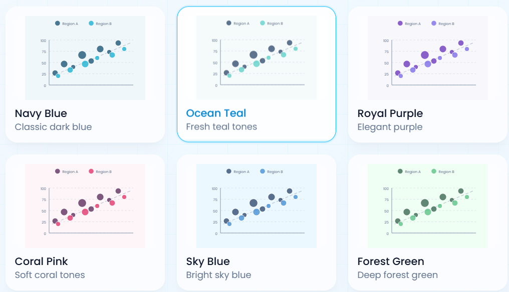
Beyond simplicity, flexibility is another critical factor. Different use cases require different types of visualizations, and a good scatter plot maker should provide customization options that allow users to tailor the output to their needs. This might include adjusting axis labels, changing color schemes, modifying point sizes, or adding trend lines to highlight correlations. These features are especially important when the visualization is intended for presentations or reports, where clarity and visual appeal can significantly impact how the data is received.
Performance and speed are also essential, particularly in fast-paced environments where decisions need to be made quickly. Traditional tools can sometimes be slow or require multiple steps to produce a final result. In contrast, modern web-based tools are designed for efficiency, enabling users to generate high-quality visualizations in seconds. This speed not only improves productivity but also encourages more frequent data exploration, which can lead to better insights over time.
Another important consideration is compatibility. Data comes in many formats, and a versatile tool should be able to handle them seamlessly. Whether you’re working with CSV files, Excel spreadsheets, or manually entered data, the tool should support easy input and conversion. This reduces friction in the workflow and allows users to focus on analysis rather than data preparation.
For more advanced users, additional features can provide significant value. Capabilities such as regression analysis, correlation coefficients, and export options enable deeper insights and more sophisticated reporting. Interactive elements, such as zooming or filtering, can further enhance the user experience by allowing dynamic exploration of the data.
Collaboration is another factor that is often overlooked but increasingly important. In many organizations, data analysis is not a solitary activity. Teams need to share insights, present findings, and work together to interpret results. A good scatter plot tool should make it easy to share visualizations, whether through downloadable files, embedded links, or direct integrations with other platforms.
Security and accessibility should also be taken into account. Cloud-based tools offer the advantage of being accessible from anywhere, which is particularly beneficial for remote teams or individuals who need flexibility in their workflow. At the same time, users should ensure that the platform they choose handles data securely, especially when working with sensitive information.
It’s also worth noting that the right tool can influence not just efficiency, but also the quality of insights generated. A poorly designed tool may limit your ability to explore data effectively, while a well-optimized scatter plot maker can reveal patterns, trends, and anomalies that might otherwise go unnoticed. This can have a direct impact on decision-making, strategy development, and overall business performance.
Ultimately, the best tool is one that aligns with your specific needs and skill level. For beginners, simplicity and ease of use may be the top priorities. For experienced analysts, advanced features and customization options may be more important. Regardless of your background, having access to a reliable and efficient scatter plot tool can significantly enhance your ability to work with data.
In conclusion, scatter plots remain one of the most powerful and versatile tools in data analysis. Choosing the right tool to create them is not just a matter of convenience—it is a strategic decision that can influence how effectively you interpret and communicate data. By selecting a tool that combines usability, flexibility, and performance, you can unlock deeper insights and make more informed decisions in an increasingly data-driven world.